Friday 25 October 2013

Development of Contents Page

This is the initial thoughts on my contents page. I am trying to link it to the colours featured on my front cover, including colour scheme and anchorage linking to the cover lines.
The size of the number seen on the picture in magazines generally tends to connote the importance of the feature, and so I am taking this into consideration here.
In this version of my contents page i have added another picture, to make the page look busy. However i can now see that the '27' from the picture has been overlapped by a picture, so will change that. I will also adjust the sizes of the pictures and possibly how they are layered as im not completely happy with them. However I have added an editors note, which I am happy with as this is a key convention of a contents page. I do think that it could be smaller though, so will adjust that.


This is the final version of my contents page, I have continued the theme of the mast head through to make the brand recognisable. I am pleased with my final design, and like the way the 'contents' over laps the first picture. It connoted the casualness of the magazine, and think it looks effective. I started off with the pictures overlapping in a list with all of them straight, however I think by slanting them it creates the look of scattered pictures and again makes it look more casual in relation to the audience it's aimed at. The anchorage seen is shown by the numbers on the pictures highlighting the features shown on the front page, and size of the numbers representing the importance of each article (biggest for  headline ect). An editors note has been added as this is a conformity to contents pages, usually relating to features of the interview in a more informal, friendly way. The features have also been sorted into categories, making them easier to find for the readers. Fonts have been continued from the front cover, again continuing a theme and making the magazine look more together and professional, along with colour. The subject of each of the headings has been made white, allowing it to stand out amongst the words.

Tuesday 22 October 2013

Development of College Magazine

So far I've chosen a picture of Scarlett. I made this decision based on the colour of the image as t was also between the other picture of Amelia. I originally started the front cover with the image of Amelia (seen on preliminary ideas), but changed the main image to this one as I thought that the colours were more eye catching, and wanted to develop a colour theme from the vibrant colour of her hair, and the general brightness of her clothes and the background allow cover lines to stand out.

Both the images of Amelia and Scarlett would've been appropriate and useful, as they both allow the left third to be used which is a key feature.
This is a next step to my front cover development, I have added a plug to make the price stand out. It is a cheap, affordable magazine as it is students that are going to be buying it. I think to improve I want the mast head to stand out more, so will make it slightly bigger. I like the banner at the bottom of the page, and a left third is also developing. I think I will also adjust the way the headline 'Scarlett Willans' slightly.
I have made several changes to my front cover, in that I have edited the mast head so that I think it stands out more. It is bigger now, and I've also made a bolder outline on the 'S', to make it stand out more, and it is in a different font, so that the 'S' looks more like handwriting like a student would do. I think that I need to move down the price plug, as it looks too close to the edge of the cover.
I'm going to adjust the headline still, as I'm not happy with it yet, and also the '16 ways..' will be changed.
This is my final front cover for my college magazine, and several changes have been made from the last version of it. As I was going to do, I have changed the price, moving it further into the centre of the circle. I've also added the date and the issue number, making it look more professional. A barcode is also situated at the bottom of the page, and this is where it will be found every issue. The issue number ect are all conventions of magazine front covers, and so my magazine conforms to these. Another convention that features is the left third, something i have taken into consideration when creating my cover. The main image of Scarlett is mainly on the right side of the cover, allowing the cover lines to be found on the left side, and the mast head to be mainly on the left, making it visible on the shelves and easily identifiable.
I've changed the colours of the reds slightly, to make them darker and more vibrant than the slightly faded red that was used before. This makes it stand out more on the covers, and also the headline of 'Scarlett Willans' is darker red than the rest, connoting that it is the most important. The '16' has been made larger, to emphasise how much information is really in there, and each cover line is accompanied by an exclamation mark, to attract attention and excite readers.The cover follows a colour theme of red, white and black, which all stand out against the background but also link into the brightness of the main image.

Monday 14 October 2013

Initial Ideas for College Magazine

Preliminary Plans

  • My magazine is being targeted at 15-18 year olds, who are undertaking further education at college
  • It will be about college life, clubs and extra curricular activities, as well as advice on the things that may be concerning them the most, such as exam techniques, tips on how to revise, and events happening around the college.
  • My coverlines will need to draw readers in, so will revolve around things most important to readers, exciting things, real life stories, dramatic news, ect
  • The name of any magazine is very important as it connotes the content, and is also the continuous feature as the magazine gets developed. The magazine is based around college life, and this must be connoted in the mast head, so the title could be a variety of things. It could be simple and to the point, such as 'College Life' 'Student', or something including a play on words, like 'College Knowledge' which works as it rhymes. 
  • Fonts are important in a magazine and the masthead will stay a consistent font. For a college magazine a font could be used that looks like typing, connoting the work thats done in college, and will be relevant to the age group being targeted as they are known for using the internet.
  • The taglines/coverlines on the cover should be relevant to students at Southdowns, including things that are important to them. Students are often concerned about money, so offers or free gifts could be an enticing feature. 
  • 4 issues could be published a year, based on the changing seasons. This will allow enough to happen in the year and the gap between the issues will allow more events ect to be announced to fill the contents. If it was a fortnightly magazine there would probably not be enough new news to create a magazine with, whereas with the change of seasons there is usually more events, Christmas, Halloween, Summer with the holidays ext.
  • For my main image, I will use a picture of a student with direct address. it will be a mid/close up shot, that will also leave space for a left third, with a background that compliments the college. We took some of these pictures around the college, using various people and settings including the cafes, drama studios, and outside.
  • The dimensions of the magazine- I think it would be an A4 sized magazine at the largest, for printing costs for the college, but also large enough to attract attention to it. Any smaller and I think that students may discard it or not notice it as much as magazine but more of a leaflet or something not to bother with as much.
  • The images and colour used on the contents page would be the colours continued from the front cover (which would have a colour theme), anchorage would be key as the most scandelous and interesting points to students (probably the reason for buying the magazine) will want to be found quickly by them.  
These are some pictures I took that could be used on my front cover.

 I think I will choose the picture to the right, of Amelia, as there is direct address, and the background is of the library, a good resource for students.
However, I do like the pictures of Scarlett, as there is lots of colour that would look nice, and could make a colour theme.


Friday 11 October 2013

IPC Media Questions

IPC Media

What types of magazines and target audiences has IPC been associated with over the years?

IPC has a broad range of magazine genres and target audiences varying from many weekly womens magazines titles, to fishing magazines. their target audiences consist mainly of middle class women, and stays within the ABC1 categories, as these are the people that are working (below this are probably unemployed) and so have money to spare buying magazines. The majority of target audiences are working women, men, and upper class women. this is because of the large amount of womens weekly magazines that IPC produces, the large amount of gossip magazines such as Now and Chat that women buy, and mens magazines such as Nuts. 
However, IPC also targets very niche markets, such as people into yatching, golf and fitness. These are magazines that allow IPC to raise the prices due to the lesser demand for magazines such as this, and as a result there as less to choose from when it comes to the people interested in the topics. 

Why might IPC be an appropriate publisher for a new magazine?

IPC is a well established magazine publishing company, which has a lot of financial backing behind it. Consequently, the magazines already successful can afford to have advertising for another magazine in it, appropriate the the target audience of the magazine already being bought. This means that the advertising will not be wasted on an audience that isn't relevant to the subject. The audience also trust the publishers of a magazine they are already a fan of, as they support it so believe that they same company would produce equally as good magazines

What sorts of genres of music/types of magazines might they be likely to publish?

IPC are already the publishers for a successful music magazine, NME which is based around indie rock music such as Arctic Monkeys, and is targeted at a mean age of 25 year olds. It is a well established magazine, which has content appealling to both the older and younger generation as it features music of both. Readers are expected to have an extensive knowledge, so the variety of music would appeal to them. Because of the existence of this magazine, IPC might be reluctant to make a music magazine focusing on the same genre of music. The company does not produce a rock music magazine, however it is a competitive type with big names such as kerrang! being targeted at younger audiences by Bauer, and Rock Sound also a well establishes rock magazine focused on a slightly older audience. IPC doesn't publish a rock music magazine, so this could be a possibility, however it would have competitive names to rival with. It may be that IPC would want to target a more niche music genre for a smaller audience, but for this reason that would pay more obey. House or club music is an ever growing genre that is becoming more known and popular with music tech and DJ/producing becoming a more desired profession everyday. There are less competitors for this genre also, with being the most known about magazine.

Why might alternative publishers such as Bauer be appropriate?

Bauer is also a very successful magazine publishing company, being the publishers behind names such as Kerrang!, FHM, Grazia and Match. Bauer is also a good financial backer to a new magazine, but tend to target a younger audience, so this could be taken into consideration when producing a new type of magazine. This could influence what type of music magazine is being created, and whether the target audience remains a young market that they already have, or whether Bauer decide to branch to a further audience of slightly older music listeners. This could be done by producing a magazine based around older music, big bands that parents/grandparents may have listened to, a chance for this a new audience to remenise on youth. The magazine could feature bands such as Stiff Little Fingers, and Pulp, influential bands of the time that reached a large audience of devoted fans, who will embrace the chance to relive their youth through a magazine like this. Another reason Bauer would be an appropriate alternative to IPC is that aswell as being a successful magazine producer, Bauer stretches to all kinds of media platforms through its successful brands. Kerrang! is a good example of this as from the magazine the brand has expanded to a radio station, a TV channel and a lot of merchandise, including its own CD's, tours/concerts and award ceremonies. With this in mind, Bauer proves that it has the capability to expand and develop a brand name.


IPC Media - Case Study

IPC Media Case Study

History of the Company

  • The International Publishing Co-operation was founded in 1963, following the merging of 3 major publishers. IPC magazines was creating 5 years later, in 1968, however each of the three companies already had existing magazines which were then produced under the new IPC name. 
  • IPC was created from three existing companies, George Newnes, Odhams Press and Fleetway Publications, each being founded in 1881, 1890 and 1880.
  •   Eight further IPC titles that are still thriving today were launched in the late 1800s: Country LifeHorse & HoundShooting TimesYachting WorldAmateur GardeningCycling WeeklyAmateur Photographer and The Railway Magazine
  •  The first of IPC's four traditional women's weeklies, Woman's Weekly, launched in November 1911 under the editorial banner "our motto - practical and useful". The same year, golfers north of the border got the first copies of their own new title, Golf Monthly.
  • In 1940, a key wartime role was played by IPC's women's weeklies, keeping up the morale of Britain's women and supplying an essential information service on behalf of the Government. Many of the Woman covers from the wartime years are regarded as classic works of art in their own right, while wartime Woman's Own covers played their own part in rallying women to the wartime cause. 
  • In 1952, one of IPC's biggest names, The New Musical Express was first published, accompanying the upserge of the music scene at the time. 
  • In 1963, IPC was born following the merging of the three major publishers of the 1800-1900s, and former competitors were suddently all working together under names such as Ideal Home, Home and Garden, Woman and Womans Own.
  • in 1996, Shoot! was first published to target the excited market of football fans following Englands World Cup Victory.
  • The women's weeklies go into overdrive, with IPC acquiring Here! from Gruner & Jahr and merging it intoNow, launched in 1996.
  •  IPC Magazines is sold to Cinven for £860m in 1998, one of the largest management buyouts in UK history.
  • NME becomes the first major UK music title to get its own internet site - nme.com - destined to go on to become Europe's most popular music website.
  • Time Warner acquires IPC Media for a cool £1.15bn in October 2001 - the biggest magazine deal ever seen in the UK and the biggest transatlantic media deal of our time
  •  ignite! launches Nuts, the world's first men's weekly magazine, in January 2004. Backed by an £8 million marketing investment, it's the biggest launch in IPC's history.
  •  In January 2010, IPC Media restructured around three key audience groups: men, mass-market women and up-market women.
IPC Media Brands


These are all the brands that IPC Media currently is behind, the largest of which being the TV Choice, and gossip magazines, such as Chat. These magazines have highest circulation as they are so cheap, however magazines with more niche markets are also bringing in a considerable amount of money due to the fact that there are less produced for this particular area, for example, cycling magazines or camping magazines, both types are published by IPC. the company can therefore charge more for brands like these as there is less options for readers, so specialised magazines can bring in the same amount of profit with less circulation and readership.

Current IPC News

  • Marie Claire celebrates it 25th anniversary by publishing a 430 page issue, the largest in 7 years
  • Feel Good Food is introducing a new line exclusively for Tescos, 'Feed Good Food- Eat Smart'
  • Essentials is offering its first interactive cover, giving readers the chance to be the cover star
  • NME refurbishment, first brand make over under new editor Mike Williams


Thursday 10 October 2013

How are musicians styled to represent different genres of music?


By looking at a performer or musician, most of the time we can probably tell what type of genre of music they are representing. Celebrities are generally, however, are at the hands of a stylist that presents them in a way that will be connoting the music/style/personality that they want to be portrayed as having, or their label/manager does. In the music industry, a lot of the time the main focus is image, and not the music, which is sad in my opinion, but it makes it easy. Fame is all about representation, as all of the fans a celebrity may gain, as much as they think they know the famous person, they don’t actually know them, and like them because of the way they have presented themselves, and been represented in the media.Ho

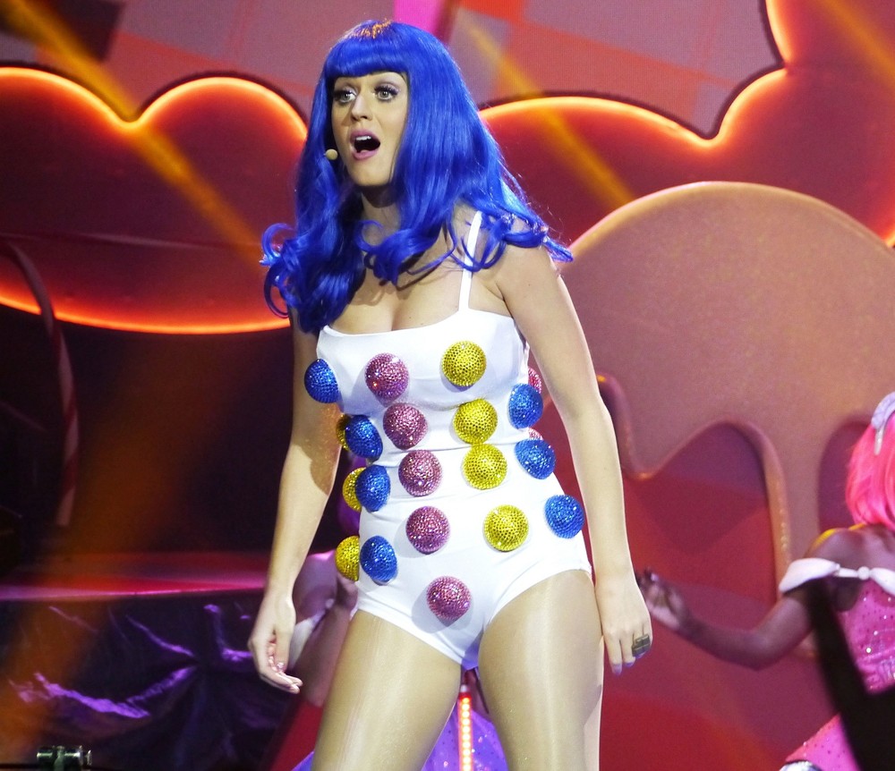
The music industry is very much focused around colour. A prime example of this is Katy Perry, an American pop star, known for her catchy chart toppers. Her image from the start has been focused around candy, clouds and bright colours. Her image has represented her as a fun person, the link with candy connotes her as sweet, and her music videos follow the same pattern of happy colours, light hearted songs and smiles (often literally on her clothes). The pop of colour that follows her represents the pop that is in her music, and we as an audience associate the cartoon, candy land backgrounds with fast paced, poppy, light hearted music. The way in which she is styled also ensures the continuing changing colour of her hair, all colours of the rainbow, from bright blue to baby pink to black. The stylists have done this to keep a focus on her, keep her in the fashion columns and style magazines, to continue an attention on her and media coverage that will gain her attention and therefore sales. However, aside from the commercial benefits, the bright colours of her hair connote her ‘freewheeling’ attitude to life, and the fact that she is a performer, linked with all the costumes, connoting she will put on a good show with costumes ect (as her day to day wear practically is one), adding to concert sales. This is a theme that runs through to fellow pop star Lady Gaga, who grabs media attention by wearing bizarre outfits. The biggest scandal was a meat dress worn to a very formal event.
Lady Gaga is a performer very much based on representation. Just from her name, she is being represented as somebody different, to watch out for. ‘Lady Gaga’ connotes the craziness that is followed through with her styling, and also her slightly alternative, although still catchy pop songs. Her individual styling brought her many fans through her lack of conformity, and still represents her as a pop based performer (through the broad use of colours and props much like Katy Perry), who will put on a very good live show.
Styling is used to represent all kinds of genre, so that audiences can quickly be notified on what sort of music they will be listening to. Another example of very clear representations are rock or punk bands. Green Day is an example of this, as they conform to the stereotype of a punk pop band, implying the type of heavier, more emotive and serious music through the simplicity of their clothing and the dark colour of it. The direct address of branding used for punk pop or ‘emo’ bands such as green day is with out a smile, in contrast to the pop genre which is usually accompanied with a smile. The lack of this in this representation is used to show the audience that they are not the usual ‘top of the pops’ band, and want to be taken seriously and talk about real issues, which they do, in their music. The styling, lack of colour and simplicity of just jeans, a stripy top and jacket, connote the band as being more focused on music than image, and aren’t hiding behind any false image. The styling represents their passion for real music and issues, and the slightly more heavy music that is now associated with dark colours in music. These stereotypes of rock/punk music are reinforced by bands such as My Chemical Romance and Fall Out Boy, also often styled in black with simple clothes, accompanied by a guitar to support the fact they are passionate about the real music that they are making.
Indie or alternative bands are also well represented as a genre, contradicting the fact that all are aspiring to be so individual. All conform to similar styles, photographed with a vintage effect camera, making them appear more worn, having been placed in looser, although more casual looking clothing if female (Florence and the Machine, Haim), or vintage style clothes and hair, often modelled on older bands (Arctic Monkeys, The Kooks).  Although probably not completely original styling, the image of vintage, less bright colours and less ‘eager to please faces’, as seen regularly in the pop industry, these representations still set these bands apart as a different music genre of ‘indie’ or ‘alternative’. The lack of focus around image suggests the fact that they are again, more interested in the music they are creating, and less about the money and publicity they are getting in the media for scandalous wardrobe choices or who got in a twitter fight with who.

Overall, the music industry is often found to be more concerned with image and publicity rather than the music actually being produced, however it is clear why. The representation of music artists is what a lot of people will base their musical opinions of the band on, finalise their choices on whether to buy that album or not, or listen to that new singer because their friend said they were ‘hot’.  The connotations given of a band on an album, music video, even just a picture in a magazine will automatically place them under a genre in peoples heads, so in a sense it is almost crucial for artists to conform to the guidelines set in place for their music type. However, in the music industry, people strive to be new, and individual and the most respected tend to be the ones less concerned with image and more concerned with the actual music. 

To what extent should magazines be held responsible for the social ramifications of the representations they offer?


Media representation is often based around stereotypes, for example young adults displayed on the news, or old people displayed in comedy shows. However, is it now that it is not the stereotypes forming the basis of teenage girls magazines, but that the images/contents of these magazines that are creating the type of teenage girl we see today?
Teenage girls magazines conform to the conventions of most other genres, with a notable left third to make the contents and cover lines visible whilst on the shelf.  A mast head is used across the top of the magazine, always in the same font to make it recognisable. The masthead is targeted towards the target audience of young girls, often connoting innocence or age within the name, ‘teen vogue’ ‘seventeen’. Like most magazine covers,, there is a colour theme throughout to make the cover more aesthetically pleasing, and tie all of the contents together, although for this genre the colours tend to be girly, quite pale colours of yellows, pinks and blues. This can connote the youth and brightness of teens, and is sometimes also relevant to the ‘in fashion’ colour, as a lot of the contents is based around fashion and personal image. The main image is always of a well-known, young female celebrity, such as Ashley Tisdale, or Taylor Swift, girls that the target audience will know, and possibly look up too. Direct address is seen, and all are smiling, connoting that to be happy, they should read inside so that they can be like their smiling idols on the cover. There are often starbursts or plugs, making cover lines stand out. Often associated with this is a large number, for expel ‘672 ways to look pretty’ .  This tells the reader how much is inside, making them think that they get more for their money.
However, there are many features seen on these front covers that are seen on a regular basis, appearing to be sexualising girls at a younger age. The imagery, content and stereotypes presented issue after issue in magazines such as ‘Sugar and ‘Seventeen’ are thought to be making young girls feel the need to grow up faster, trying to keep up with what these magazines are portraying as normal, and pressurising them into discovering ‘476 ways to be irresistible’. The coverlines for articles portraying the magazine giving general girl advice could really be the issue manipulating young girls into thinking that they have to follow the rules set by image based magazines such as these. The largest cover lines on the page, the headlines if these are not situated around the celebrity on the front, are image based, ‘Fashion Wishlist’ ‘Pretty for Spring’ ‘The Cutest Clothes’, the size and coloured attention on these features make them seem like the most important feature in the magazine, connoting that they should be the most important for that reader. This could put much added pressure on the reader, to be able to financially , mentally and physically keep up with all the new ‘must have’ clothes, make up and styles that seem so important to the creators of these magazines. The smaller coverlines also tend to be image based, ‘toned abs, and a great butt!’. Readers of these magazines are targeted to start at the age of around 12, an age at which how toned your stomach is, and how nice your bum looks should not be an issue. These magazines are destroying the confidence of developing girls, by placing flawlessly beautiful, skinny (airbrushed and edited) women on the front that readers then compare themselves to. They then add to readers comparing themselves to these celebrities by adding coverlines such as ‘get Cheryls hair!’, which will put girls down when it doesn’t look like its been made by a professional like on their cover.
Cover lines such as ‘flawless skin now!’ can also be damaging the self esteem of readers, asThey are drawing attention to the fact that not having perfect skin should be seen as a problem.
As well as damaging readers by making them notice flaws, and draw attention to image and body shape that they otherwise may not have noticed, the language and focus of these magazines are sexualising young girls far too early, through language, pictures and connotations used. ‘The big boy mate question- to snog or not to snog?’ this is manipulating how girls could be viewing their friends that are male, changing opinions or adding pressure to the relationship, and also creating ‘snogging’ as a social norm. With such young readers, suggested to be starting at the age of 12, the feature could be seen as encouraging this behaviour, or making the reader feel like they should be doing this, as it is what’s seen as normal at this age, and what ‘everyone’s doing’. ‘Instant Turn Offs’, is often a term seen on covers of magazines such as this, which has sexual connotations, implying that rather than turning them off, you should be turning them on.
Often, these magazines offer free gifts of lip gloss, fake tan or other cosmetics promoting a brand. The constant promotion and encouraged usage of these products in the magazines, through free gifts, advertising and articles on ‘how to look pretty’, which remain focused on beauty products are creating the view of teenage girls that to be socially accepted and viewed as ‘pretty’,  these products have to be used. Teenage girls are competitive with one another, and so to effectively ‘win’ the boy that these magazines claim are so important, they have to look the best, through the advice given in these magazines. The stereotype of younger girls being covered in make up, wearing shorter/tighter clothes could be down to the way ‘winners’ are represented in the features.
On the same note as the competitiveness of keeping up with fashion/style within girls at the age these magazines are targeted at, ‘real life’ articles could be doing similar damage. ‘How to deal with rumours’ articles such as these focusing on the bitchiness of schools, and the rivalry between females can be dragging the idea of competitiveness to younger readers that may not have found it yet.
However, the representations presented could not only be influencing female readers, but the stereotypes of males could be having an affect also. ‘Best boy advice ever!’ is talking abut how to act around the whole male genre, and collectively talking about males preferences in clothes and style, and not appreciating individual differences. Female readers are being told how to talk to boys, and act around them, whilst males are being analysed as a genre on the way they act, by young girls, to tell ‘if he likes you’ by normal acts he is unknowingly doing. Overall, the stereotypical representations presented of both genre are damaging young people, and discouraging individuality by the features targeted.
On the other hand, these magazines do sometimes offer positive influences towards the target audience. The cover star/main image, sometimes offers inspiration to readers other than how to get hair like them. Last year offered this regularly in the summer of the Olympics, where female sporting stars featured regularly on the cover, encouraging health, sports, positive advice as well as image tips. Also, real life stories from readers or ‘real girls’ and features that are dedicated to real life issues such as eating disorders, how to protect yourself and issues at home. Quite contradictory to a lot of features appearing regularly, they sometimes target self esteem issues, such as self harm. These articles really can help with peoples problems, and lives, and give advice that they may be too scared to ask for help from someone they know. Knowing how to cope with issues such as these is good, however with each issue only mentioned maybe once a year, the majority of content is focused on bettering oneself when many would see that reader as good enough already. With the contents filled with pretty, perfect models of how people should look, the bar for image for young girls has been set high. As well as all of these representations of normal that are included, what about the ones not included such as girls featured with a disability? Rarely are people with a disability included in fashion/teen magazines, implying by doing so that they are not up to a high enough standard to be in a magazine like this. It is alienating these people/issues that are not included as not ‘normal’ or winning, as the magazine has a much less focus on it than how to improve your looks.
In conclusion, I as a reader of magazines such as these would like to see raised awareness towards real issues, the inclusion of disabled, inspirational people for girls to look up to, and more people to aspire to be like that don’t include how to look like them. Also, a wider variety of fashion articles, more enthusiasm towards individuality, and this could be achieved by offering a column a week to a reader, giving real girls opinions. There needs also to be a more serious look at the language/focus of some magazines, especially the ones that tend to be sexualising girls more than others, which shockingly, is the magazines more aimed at younger audiences, such as shout and sugar. Teen Vogue refrains from this, taking a more sophisticated approach, not excluded from the indecency of some topics and phrases, but mush less frequent and the magazine itself is aimed at a slightly older, more mature audience. Regular checks need to be made ensuring that the media guidelines are being fulfilled to prevent against the changes and influences they are having on teenage girls, and the representations of them.


Conventions of Women's Magazines

conventions of womens.docx

Wednesday 9 October 2013

Magazine Cover Analysis - Kerrang!


Kerrang! Magazine is a rock music magazine targeted as 16-24 year olds. The name Kerrang! for a music magazine connotes the sound of a guitar when strummed, and with rock music being heavy in guitar solos, the target audience will appreciate the relevance of the name. it also has a ‘!’ at the end of the word, which connotes loudness. Rock is a genre of music that is associated with being loud and exciting and with the word all in capital letters, the mast head of Kerrang! connotes all of these things, appealing to the target audience of younger music fans. The masthead is seen in white on this issue, larger than any other thing on the page, in a no-serif font. The use of no-serif and the fact that all the letters are the same size, are thick and slightly rubbed out is represents that the magazine isn’t about image (from the ‘dirty looking’ letters), but is about the music, loud, excited and wants to be seen. The lines or ‘cracks’ through the letters implies the loudness the magazine expects the music to be played, looking like a cracked mirror that supposedly happens when things are too loud, or guitar strings going through the word.

The main image is of Hayley Williams, well known lead singer from the pop-punk band Paramore. The use of direct address is drawing the reader in, as seen on vogue but in slightly different ways as directed at an entirely different audience. As a pose to Vogue, her face and fists are the only parts of her really visible, because the readers of Kerrang! are not interested in what she’s wearing, but what she has to say about her actions/music. She is recognisable from her red hair, and so this the red colour is used as a colour theme throughout the cover. In the main image however, her hair is pulled back, implying she is stripping back in the interview, telling all with nothing to hide, and her pose that appears to be punching implies that she is still as strong and tough as ever, daring you to read on. These implications from the main image as supported in the headline, which is displayed on her fist, connoting that she is proud of what she has said. ‘I am who I am’, represents the fact that she is baring all in the interview, and ‘doing it her way!’ supports the strong pose. A pull quote is used to give the reader a preview of what is inside the article, and is usually exciting or shocking to entice them into wanting to read more. This effect is used here, making the reader want to read/buy the magazine, so that they get to find out what Hayley is doing her way. The effect of using Hayley Williams on the front cover, is appealing to the target audience as she is a well known lead singer of a successful band, which many of the readers will like as they will be interested in this genre of music, and possibly aspire to be like, because as readers of ‘Kerrang!’, they will have a keen interest in music, and with it being a big part of their life possibly play an instrument, already be in a band and doing their best to get to the top. If this is the case, as it will be for many readers, putting a musician on the front cover, with the headline ‘doing it her way’, readers would be enticed by this as they want to know ‘how she did it’, because they want to do it too.

The colour theme of red, white and black works as it is loud, catches the readers attention, aswell as representing the type of magazine it is, loud and proud of who and what it is. There are box outs along the bottom of the cover, which make the image presented stand out from the main image. The white border in this case contrasts with the reddish background, and the black and while image do the same, drawing attention to them. In one case, the bundle of pictures are of posters with the coverline ‘poster special! MCR, Bullet for my Valentine, Avenge Sevenfold and more!’ is attracting the reader by also advertising a free gift offer of posters that they will get within the magazine, a gift they can only use after buying it. The buzzword used here would be ‘Special!’, which is grabbing the readers attention, and adding pressure to them as they feel like the magazine is a special, and will only be out for a limited time, so they need to buy it. The target audience of kerrang! would be stereotyped to have a wide love and knowledge for music, with musical rock idols. For this reason, ‘free’ posters is adding incentive to them to buy it, and attracting the right kind of audience of younger (posters on bedroom walls) rock fans.
There is also a plug seen in the top right hand coner with the buzzword ‘win’ around the edge. Within the circle, is the prize, which in this case is the chance to see a band. This is an appropriate cover feature, as the prize is one that would entice readers with the correct music, and gig atmosphere being offered. The plug is also strategically placed in the corner of the page, enticing them to open the magazine and continue reading. Along the top reads ‘who rocked your world?’, which connotes just from this that the magazine focuses on the readers views and what the audience wants to see in Kerrang!. For an audience with a very specific music preference, this is ideal for a cover feature.